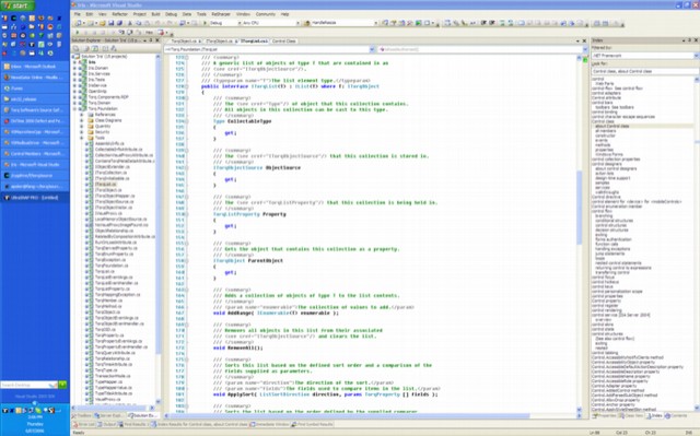
Task Bar Positioning
Ayende Rahien has a post on multi tasking and real estate and asks the question: How does your taskbar look at the moment?
I used to have it two levels deep on the bottom of the screen – three deep seemed to eat into the main display too much. Now that my main machine has a wide screen monitor, the preferred approach is docked to the left of the screen. This allows all the running programs to be easily listed and a good portion of their titles are visible. It also provides a decent amount of room for the quick launch buttons, a search box and the system tray (or whatever its official name is). It would be handy if the various video players could dock themselves neatly into the taskbar so I can watch “talking head” videos in a small region of the screen without obscuring the main work area.
