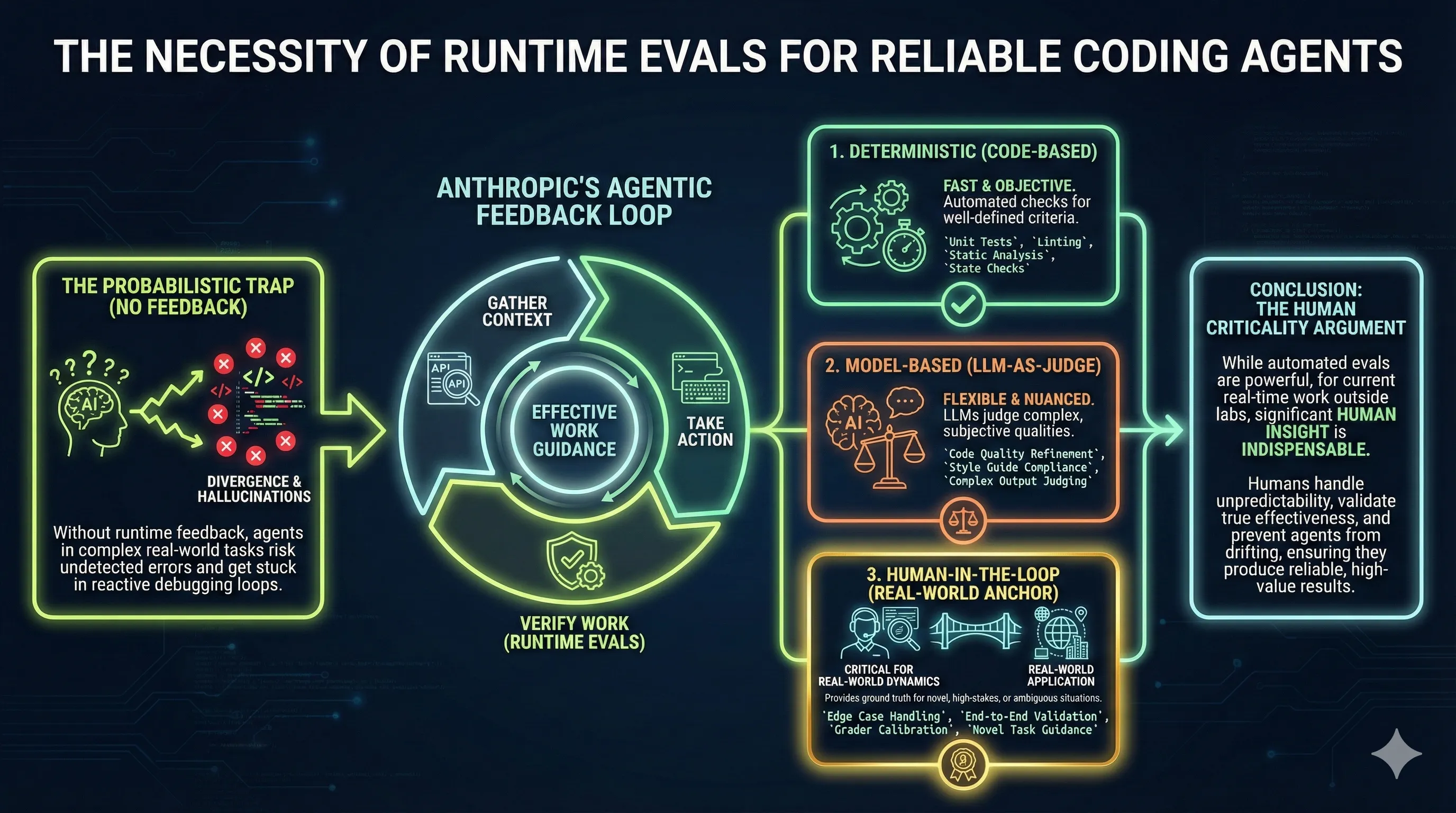
I wanted to communicate some concepts about getting agentic loops to work reliably in a Teams chat. I had recently come across Anthropic’s blog post “Demystifying Evals for AI Agents”, and their categorization of three feedback mechanisms stuck with me. They grouped verification mechanisms into code-based graders (deterministic), model-based graders (where you ask a model to reason on work output and provide judgment), and Human in the Loop graders.
My goal was to communicate to business owners and clients that you can get reliable output from AI if you use an agentic loop and invest appropriately on both ends. On the input side, sort out your data so the context provided is clean, organized, and searchable for the tasks. On the verification loop side, invest in deterministic graders written in code and model-based graders where appropriate. But don’t expect the human to be out of the loop for these probabilistic systems.
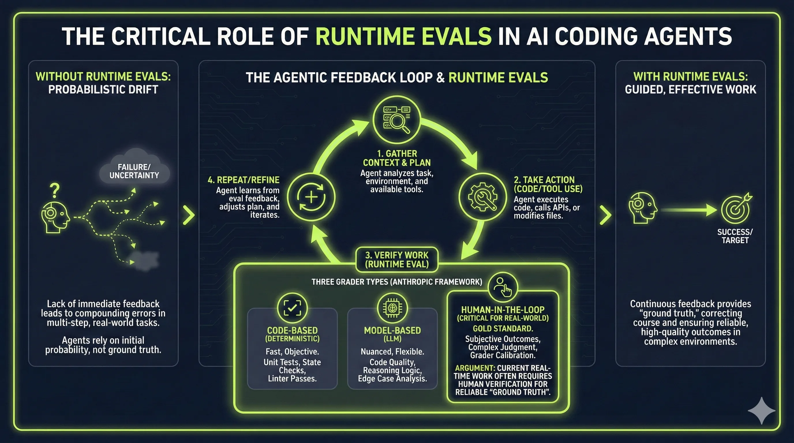
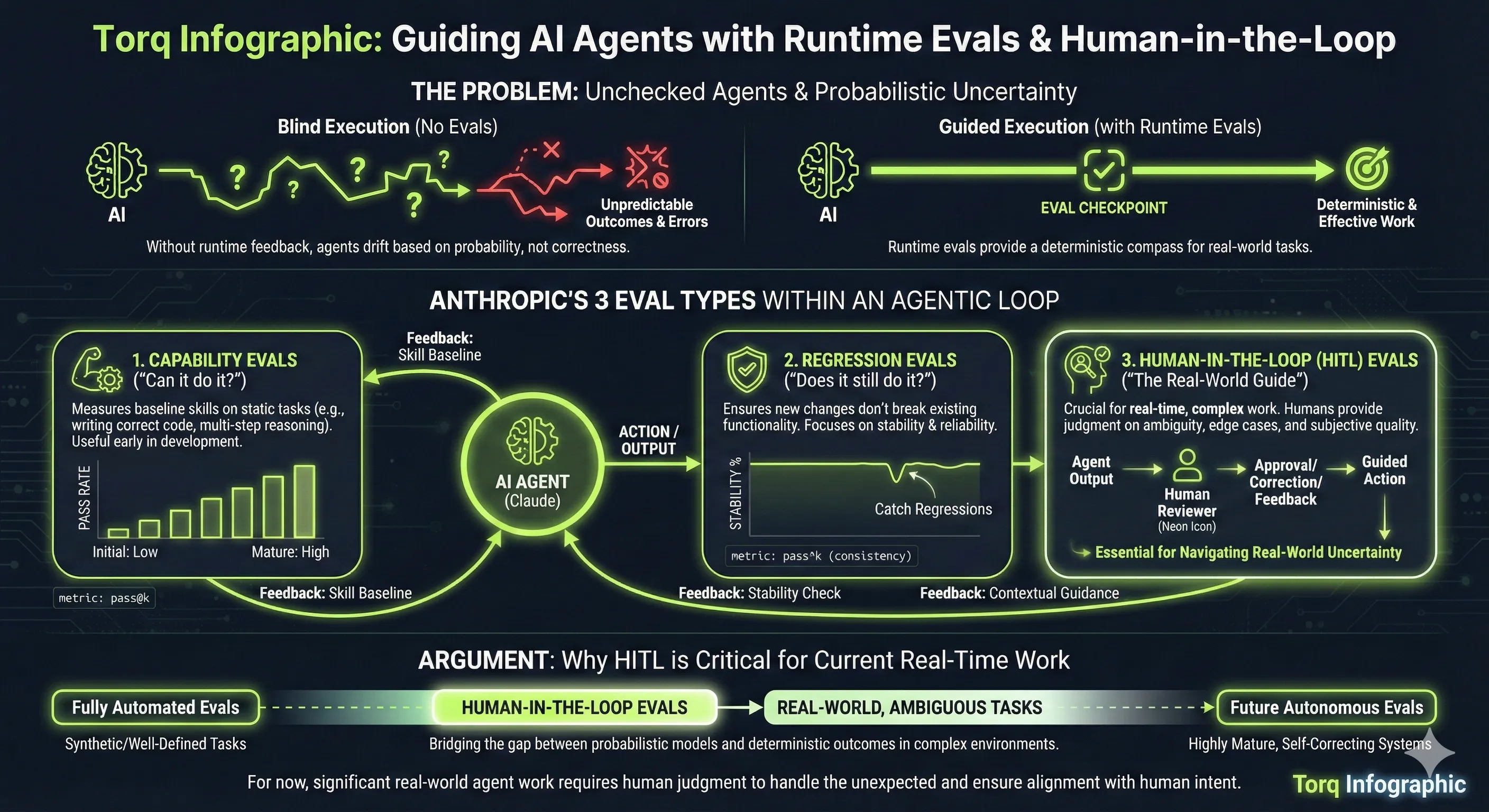
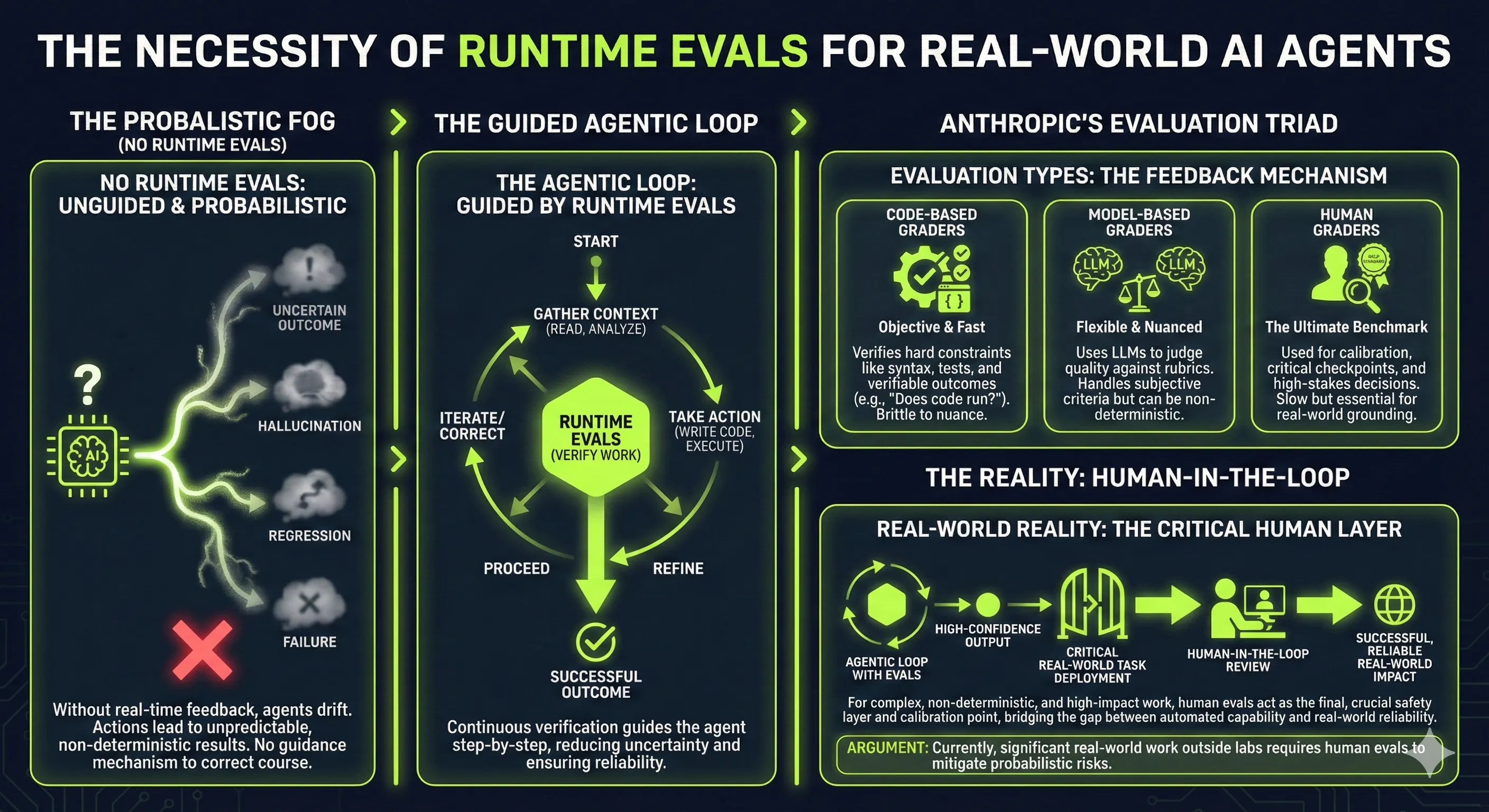
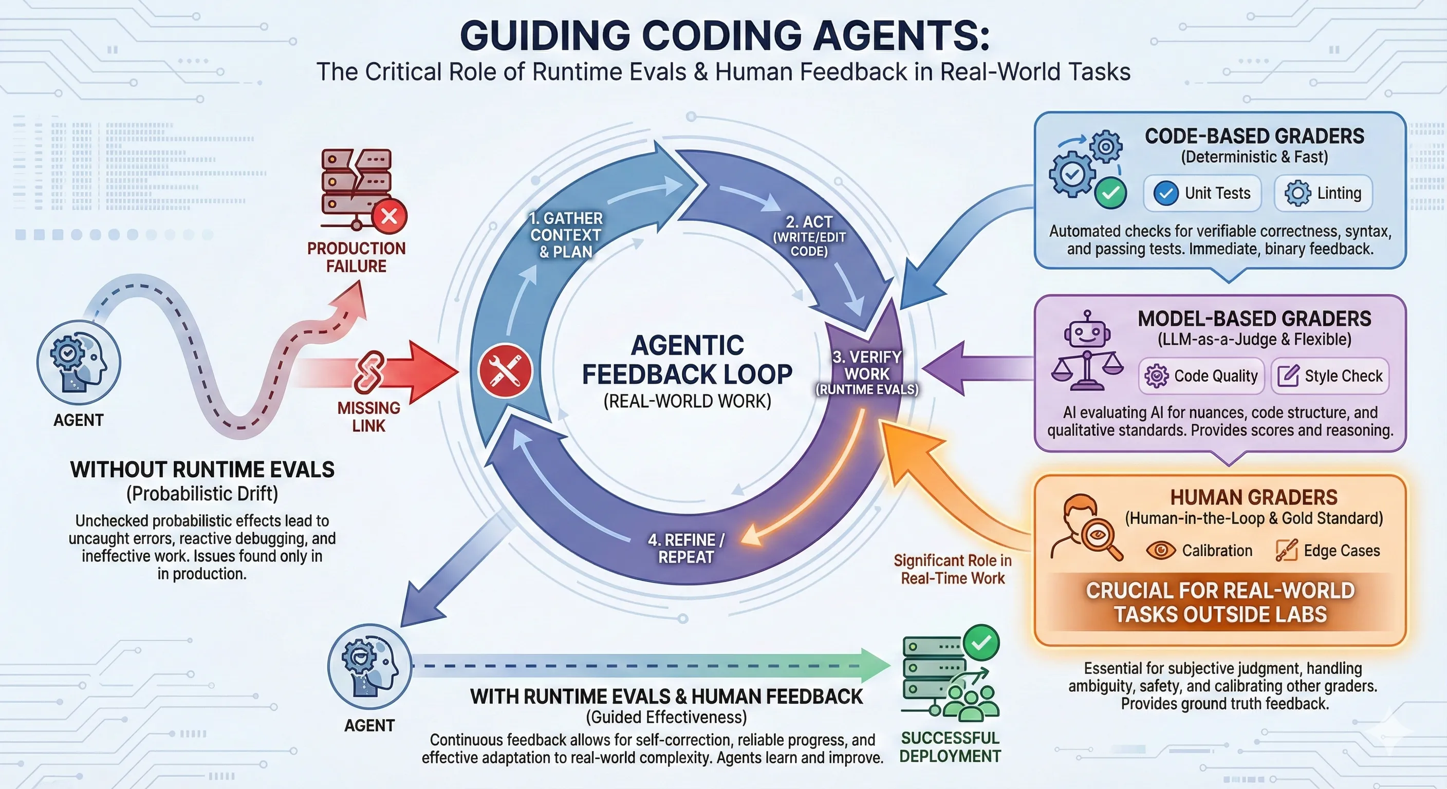
The Anthropic article is useful, but most people probably wouldn’t read it. If you’re not deeply into software development, you’re not going to read a document like that and extract the core concept. So the next step was putting it into a diagram using Gemini and asking for an infographic.
Here’s the prompt I used:
Research these links first:

https://www.anthropic.com/engineering/demystifying-evals-for-ai-agents

https://www.anthropic.com/engineering/building-agents-with-the-claude-agent-sdk

Create an infographic that communicates why coding agents working on real-world
tasks need runtime evals to guide them to do effective work without the
probabilistic effects that occur if the runtime eval feedback is not available
to guide it. It should show the three different types of evals Anthropic have
documented within a feedback agentic loop to do real work. My argument is that
at least for the current time, a significant amount of evals for real-time work
outside the AI labs will involve a human in the loop to provide those evals.
One important point that some people don’t get yet: if you ask Gemini to do web searches as input, it provides that as grounded context. It’s not just whatever the LLM thinks. It’s specifically the context you’ve put into it by saying “read these pages on the web, then formulate the infographic from that information” rather than relying on what was trained into the model initially. The result was good using Nano Banana Pro. There may be spelling mistakes hiding in there, but nothing obvious stood out, and it communicated the concept well enough for a Teams chat post.
Writing a blog post about this seemed worthwhile, but there’s a challenge with visual outputs from LLMs. People get used to seeing a particular style, and it’s like fashion. Great when it’s new, but once people tire of it, a new fashion cycle is needed. Otherwise you get classed as old and staid or AI slop or some other denigration, without consideration for the content being communicated.
For a blog post, establishing a consistent style for info-graphics on the Torq website seemed worthwhile as it establishes a visual consistency with the website styling and would be different from the default Nano Banana info graphics style. The solution was creating a Gemini Gem, which is basically a reusable prompt for creating Torq info-graphics. The results are shown in this post. You can see the Gemini visual watermark on each image.
Here’s the Gemini Gem prompt that defines the style:
Create a professional, horizontal infographic using the specific content
provided at the end of this prompt. Adhere strictly to the following visual
style guide:

1. Visual Identity (Tech/Dark Mode):

Color Palette: Use a deep, near-black navy background. Use vibrant Neon Lime
Green as the primary accent color for charts, icons, and dividers. Use clean
White for the main text.

Background: The background should be dark and uniform, optionally featuring a
very faint, subtle pattern of tech icons (low opacity) to add texture, but it
must remain clean.

Typography: Use bold, modern Sans-Serif fonts for all main headers to ensure
readability. You may use a Monospace font only for small data labels or
statistics to provide a subtle technical feel.


2. Layout & Design Structure:

Format: Standard horizontal infographic layout. Organize information into a
clear visual hierarchy (e.g., Top-down flow, Timeline, or Comparison columns).

Graphics: Use standard infographic visualizations—bar charts, donut charts,
flow arrows, and line icons. Style these elements with a 'neon glow' effect to
match the theme.

Containers: Do not use terminal windows, command prompts, or code editor
aesthetics unless explicitly instructed to do so. Group information using
standard infographic design elements like floating panels, horizontal dividers,
or simple rounded rectangles with neon borders.

Vibe: Corporate, innovative, and sleek.

Content to Visualize:
Google AI Studio offers an API route to generate these without the watermark. But honestly, it doesn’t bother me that much. There will be a non-visual watermark embedded anyway. For this web content, communicating concepts matters more than worrying about an AI watermark. This might change at some point if it becomes convenient to make the switch.
When generating these images, the LLMs are probabilistic. Every run produces different content based on a different set of random probabilities. Just for the sake of experimentation, the same prompt was run against the Torq Infographic style guide multiple times. You can see the different results in this post. The core information appears in subtly different ways, but it’s arguably consistent enough to communicate the intended message. Then it becomes a style and taste question about which image to use. That’s another example of using the human as part of the verification loop for deciding on the final result.